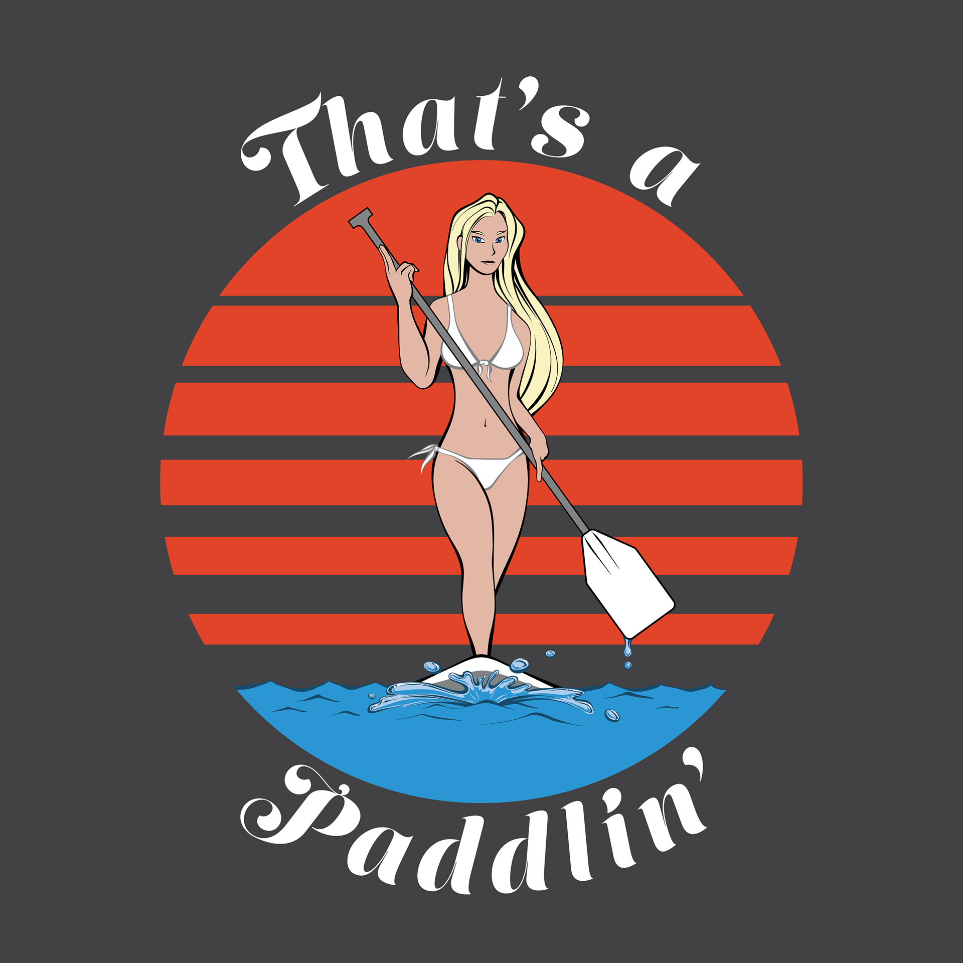
Close up of the graphic. Normally I would use 3 times the colors seen here, but extra colors printed on t-shirts cost a lot of money, so I pared it down to 8. My client wants a 2-3 tone version that I'm working on to cut back on printing costs, and I will post as soon as I finish it. I think it'll turn out pretty neat, with a lot of contrast and that stenciled feel.
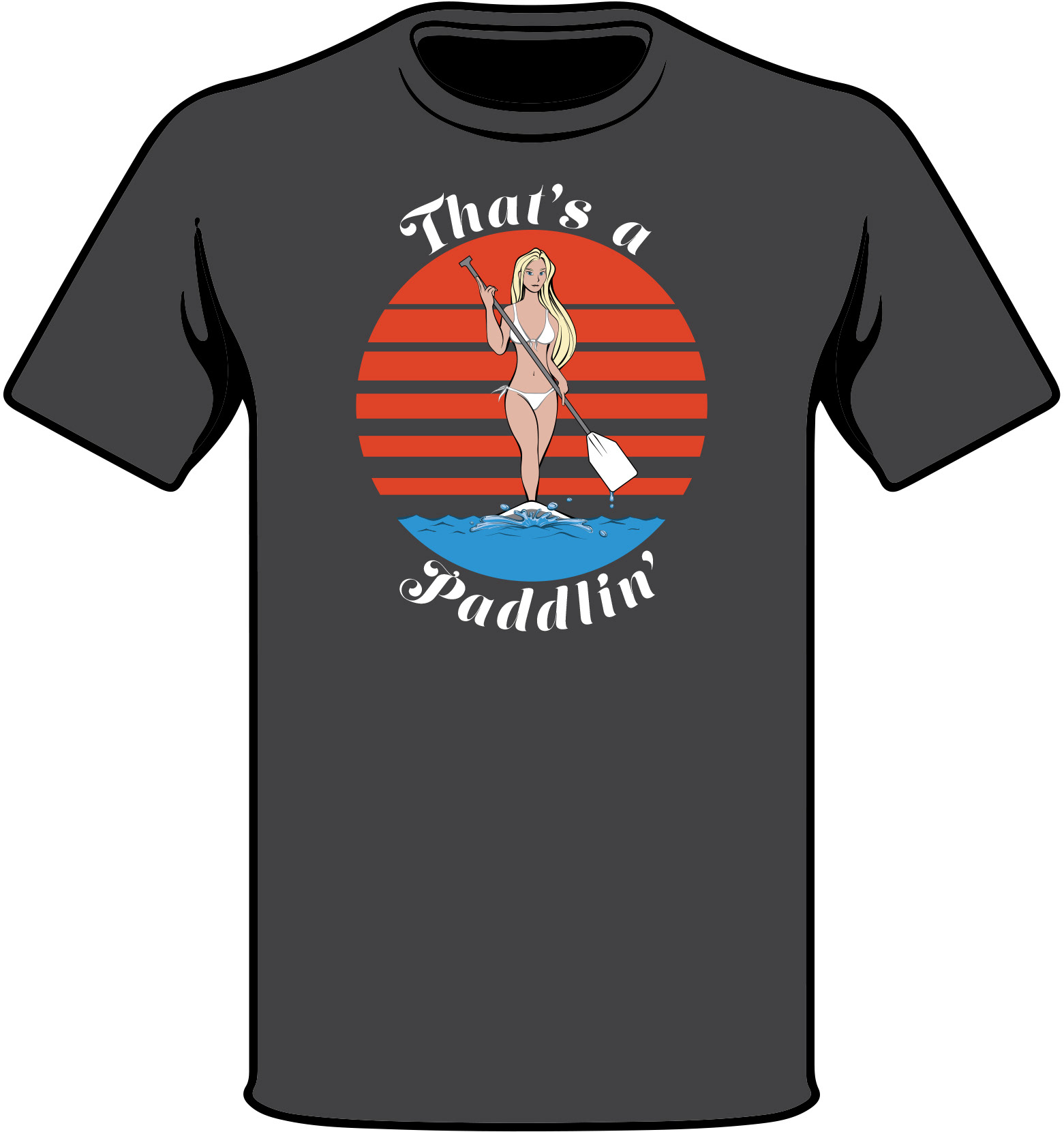
Basic idea of size and placing, as well as t-shirt color.

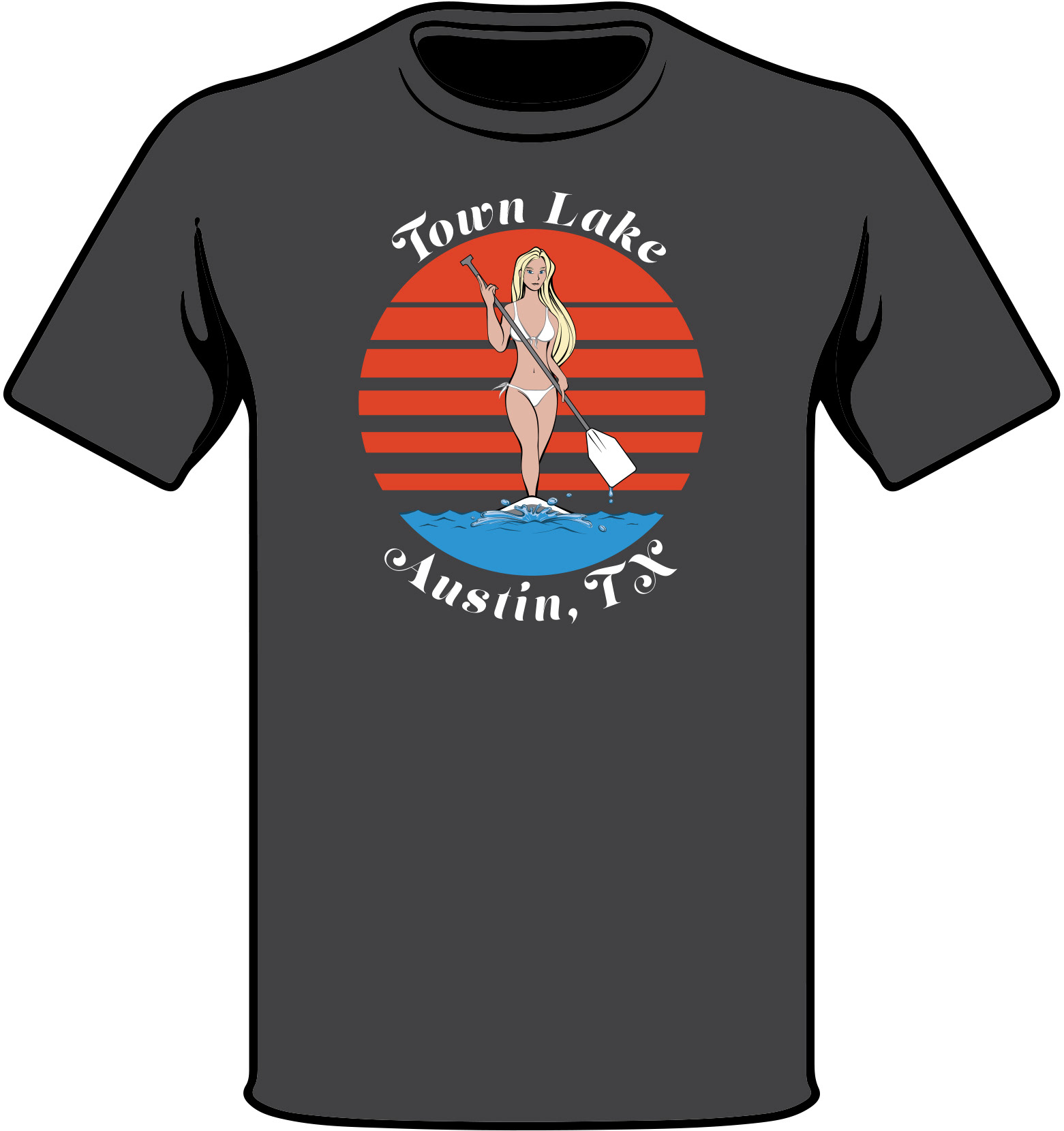
A local version to cater to our fellow Austinites. Town Lake, and the many paddleboarders who frequent the spot, were the inspiration for this design.
Just for the sake of thoroughness.

The two tone version.
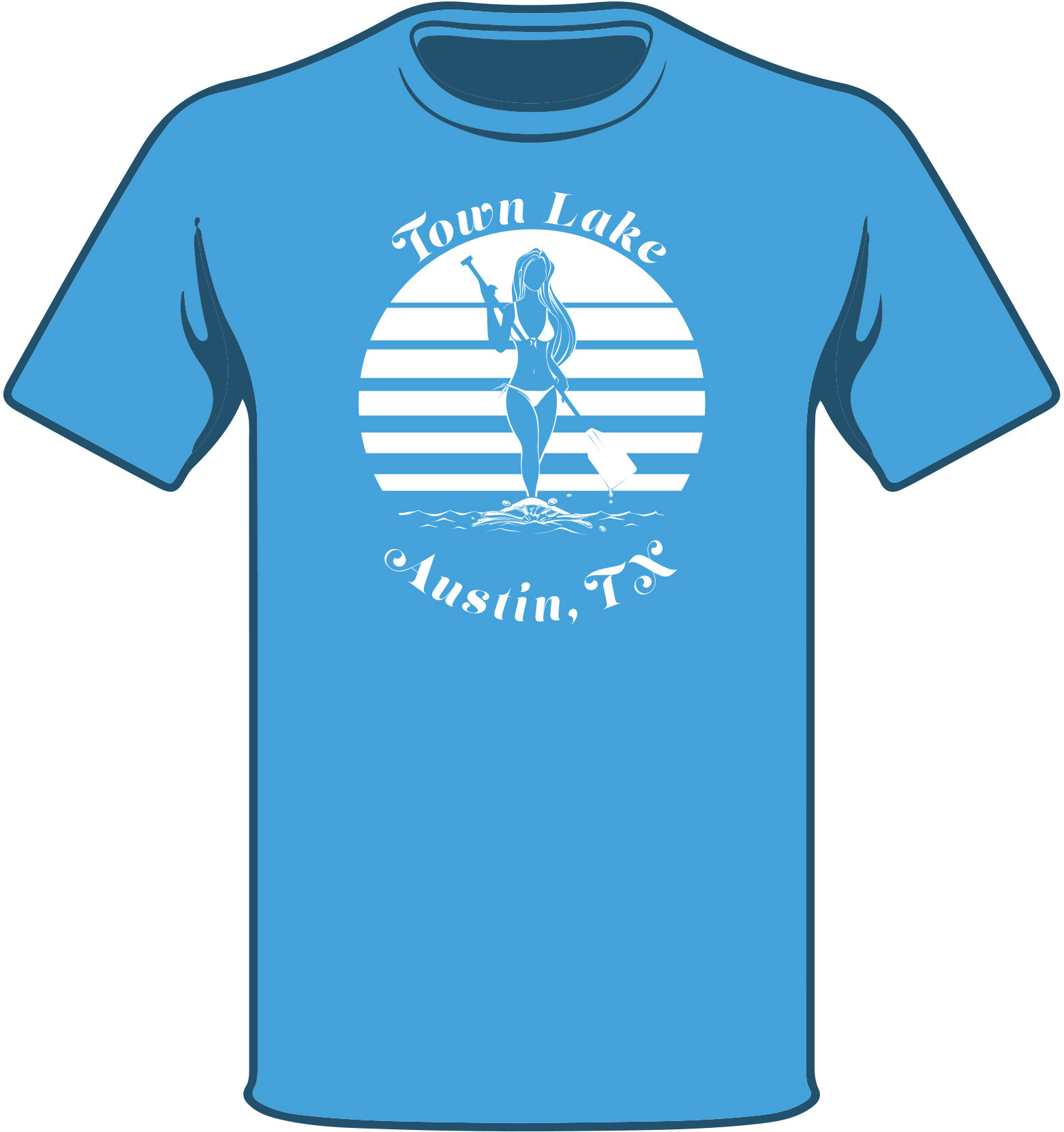
Grey was originally chosen as the color for the shirt, primarily because of the contrast with the orange sun. Now that we are dealing with all white, the t-shirt color choice is much more open. I went with a light blue to invoke a feeling of a cloudless summer day.

My client was very happy with the two tone version of the design, but was curious as to what I could do with three colors. The blue and the orange certainly bring a lot of pop to it. Nothing wrong with giving customers more options either!

For those of you who like this shirt, but don't live in Austin, all of these color variants will have a 'That's a Paddlin'' version as well. The Town Lake shirts will be available for sale at Austinite Clothing Company, and the 'Paddlin'' variants will be up on threadless.com soon. Thanks for checking out my work! And, super thanks if you buy one!!!