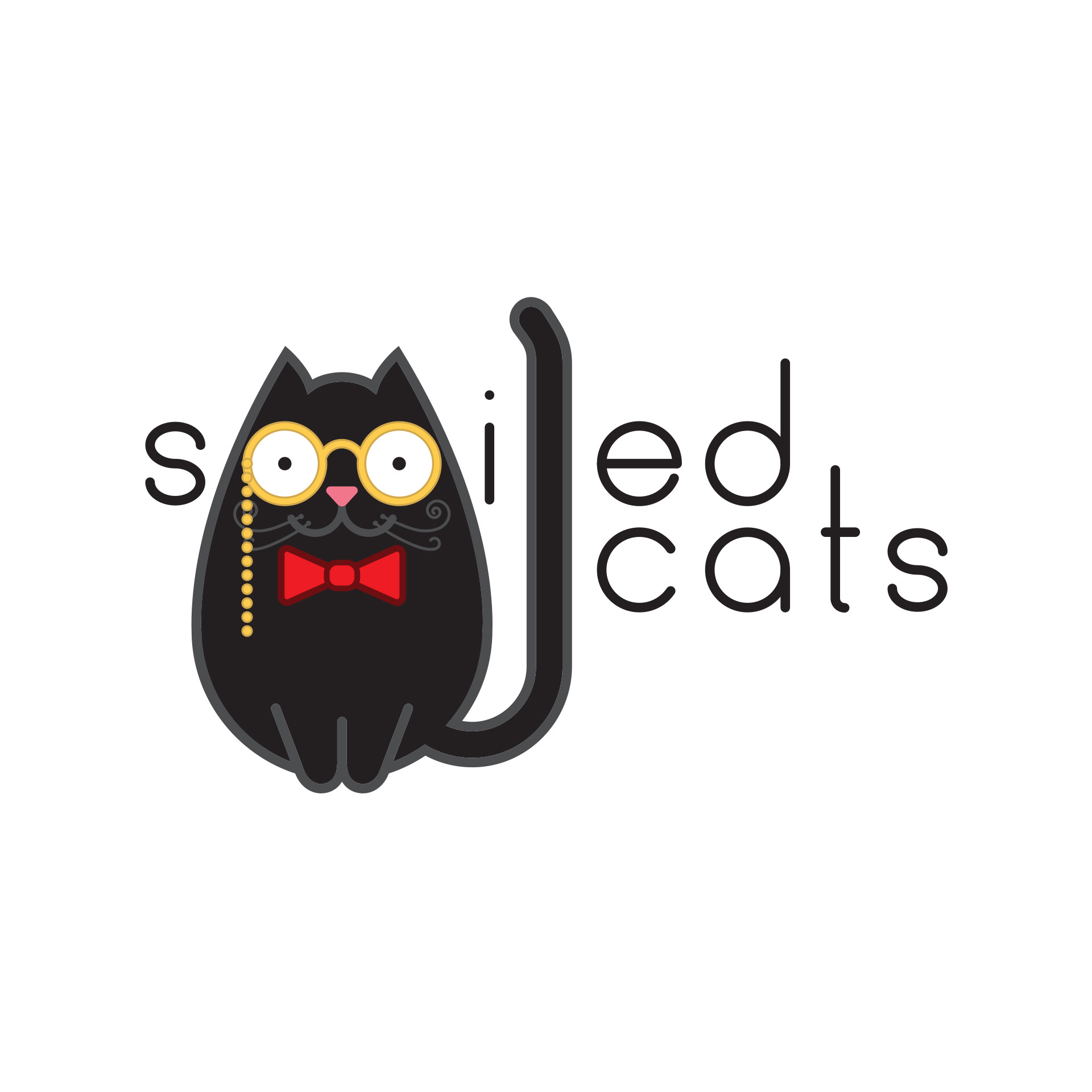
This is my original vision for the logo. The entire design is built around the circles that form the frames of the glasses. I crafted the logotype by hand to fit perfectly with the glasses and kept the letter forms soft with rounded ends. I also liked how the logotype fit together compositionally, with the four circles contained within the letters e,d,c, and a lining up nicely to form a rounded square.
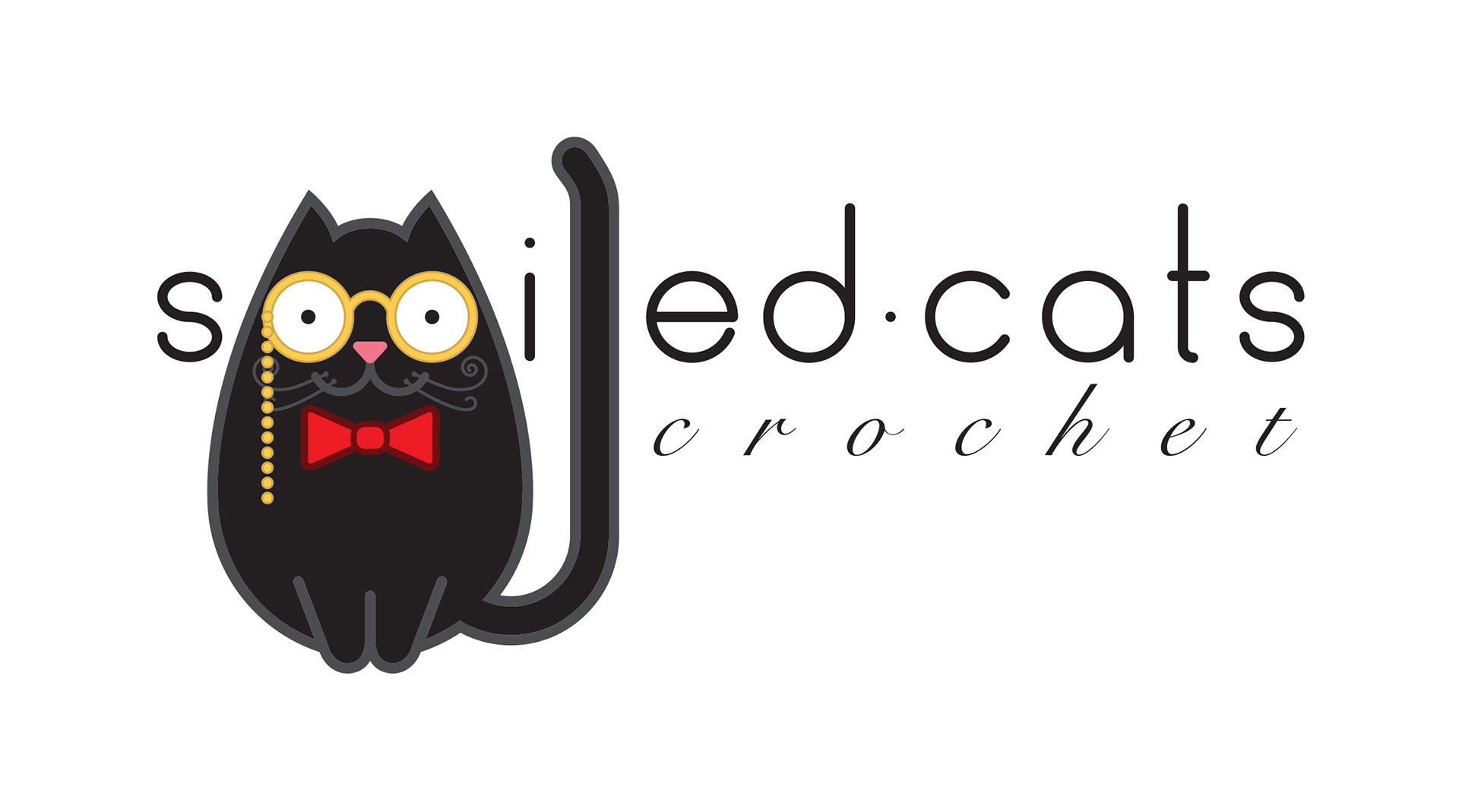
My client also wanted a version of the logo with the word 'crochet' included, so I came up with a more horizontal design that could incorporate it. The type hierarchy also played out nice. My client was very pleased with both versions.
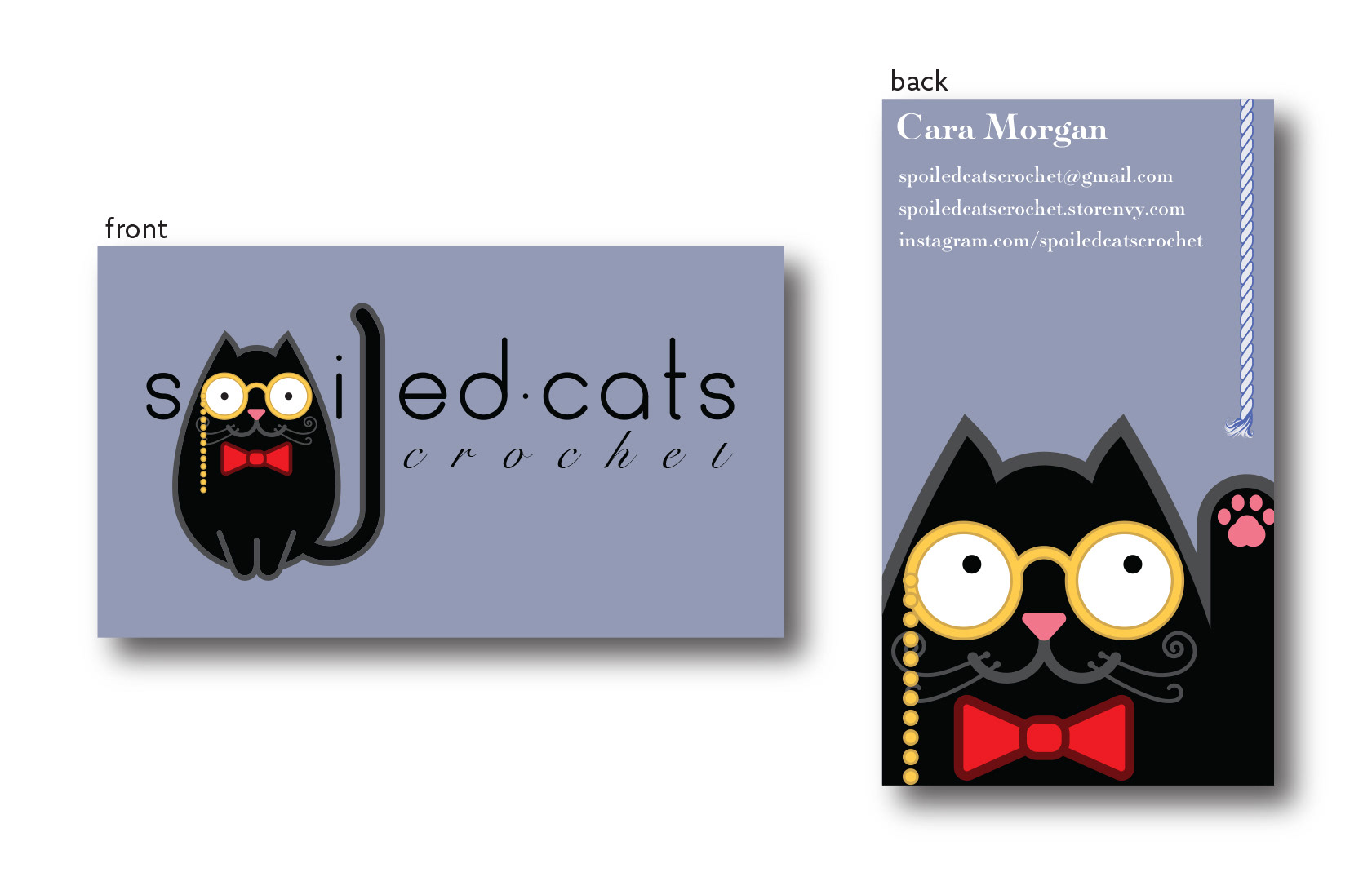
Business Cards. Trying to keep that balance between cute and classy.